NOAA GLANSIS
UI/UX Website Redesign for NOAA GLANSIS
Timeline
SEP 2023 - DEC 2023
Role
UX Designer
Tools
Figma
⋆ABOUT NOAA GLANSIS⋆
NOAA GLANSIS (Great Lakes Aquatic Nonindigenous Species Information System) is a NOAA-managed database on non-native species in the Great Lakes. It provides data on invasive species that could harm the region's ecosystem, economy, or human health.
Imagine you are a student working on a marine life project, tasked with listing newly discovered sea creatures in a specific ocean region. Unfamiliar with marine biology and struggling with complex websites, you find NOAA GLANSIS, which has the necessary information. However, the interface is so confusing that you spend precious time trying to figure out how to navigate it. Eventually, you stumble upon a search bar tucked away in the corner that could have saved you a lot of time if you had found it earlier.
This scenario mirrors user experiences with the original NOAA GLANSIS design. Despite holding valuable marine life data, its outdated and unintuitive interface forces users to spend time learning to navigate it instead of focusing on their research.
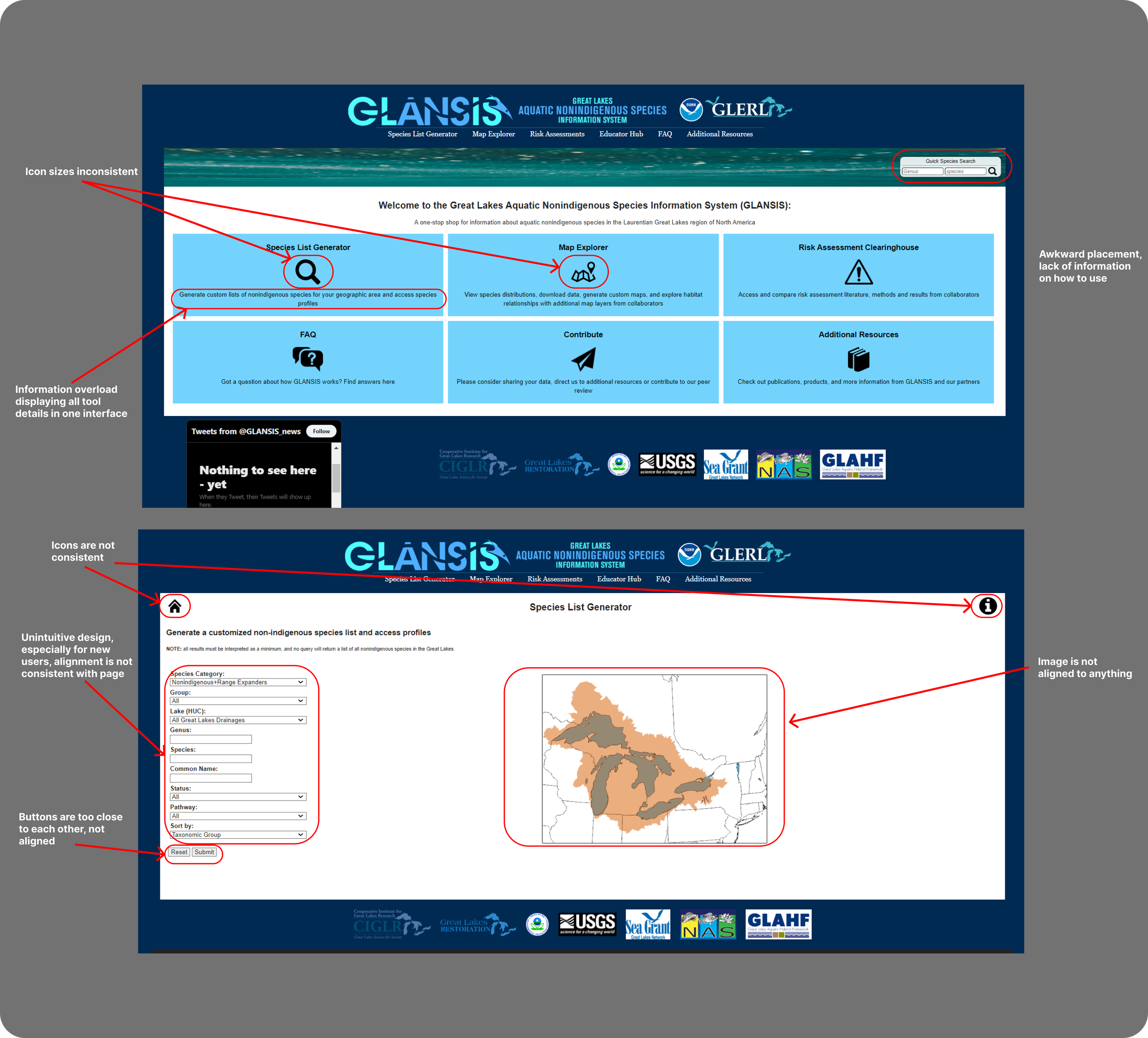
⋆PROBLEM
The GLANSIS website offers vital information on nonindigenous species in the Great Lakes and highlights key threats to biodiversity. However, its cluttered design hampers accessibility, forcing users to rely on inefficient email inquiries and making comprehension difficult for people of varying backgrounds and expertise.
⋆PROJECT GOAL⋆
To redesign the GLANSIS website to reduce confusion,
focusing on the species list generator page.
⋆CURRENT USER ISSUES:
⋆USER GROUPS:
Researchers:
Input information to the site while on the field
Iterations:
Students:
Grade school students who use the site as a source to research indigenous species for project
⋆DESIGNING 5 MOBILE FRAMES
PROBLEM
Teachers:
Educators who use the site as a method to teach students about nonindigenous species
We were tasked to make 5 mobile web designs using Figma for the first part of our project. We chose to start with mobile so it will be easier expand later on, and we could include the basic functions of the page from the beginning
⋆ADDING DESKTOP/LAPTOP DESIGNS
There were a total of 3 iterations. It is very satisfying to see the growth over each iteration
First Iteration:
We performed multiple qualitative tests and heuristic evaluations with classmates and GSI’s.
Based on the feedback received, I discovered that my initial designs lacked intuitiveness and features to enhance the application's usability.
Final Iteration:
Check it out! ;) (Click on the phone or laptop to see it in action!)
My Final Thoughts.
After doing a usability assessment with classmates, the redesign of the website increased user’s ability to access information by about 30% compared to the original design.
Users indicate that the redesign allows them to easily “discover what they need to do to achieve their goals.”
After concluding the project, I gained some important insights, including strategies I would pursue given additional resources and time.
I would have performed additional rounds of user testing with the prototype to identify more usability issues and uncover any overlooked steps or information that could be crucial.
I wish I had collaborated more closely with the developers responsible for building the website to ensure my design decisions could be effectively implemented. Although some choices appeared satisfactory in aesthetics and usability. Collaborating with the developers could have allowed me to refine my designs and optimize their implementation.
⋆IMAGINE THIS…
Client List
UX Designer, 2023
Ann Arbor SPARK
UX and Brand Designer, 2024
NOAA Glansis
Design Lead, 2023 -2024
MHacks


